
This guest post is by Stephen Turner on his preprint qqman: an R package for visualizing GWAS results using Q-Q and manhattan plots, available on bioRxiv here. This is a modified version of a post from his blog.
qqman: an R package for visualizing GWAS results using Q-Q and manhattan plots
Three years ago I wrote a blog post on how to create manhattan plots in R. After hundreds of comments pointing out bugs and other issues, I've finally cleaned up this code and turned it into an R package.
The qqman R package is on CRAN: http://cran.r-project.org/web/packages/qqman/
The source code is on GitHub: https://github.com/stephenturner/qqman
The pre-print is on biorXiv: Turner, S.D. qqman: an R package for visualizing GWAS results using Q-Q and manhattan plots. biorXiv DOI: 10.1101/005165.
Here's a short demo of the package for creating Q-Q and manhattan plots from GWAS results.
Installation
First, let's install and load the package. We can see more examples by viewing the package vignette.
# Install only once:
install.packages("qqman")

# Load every time you use it:
library(qqman)
The qqman package includes functions for creating manhattan plots (the manhattan() function) and Q-Q plots (with the qq() function) from GWAS results. The gwasResults data.frame included with the package has simulated results for 16,470 SNPs on 22 chromosomes in a format similar to the output from PLINK. Take a look at the data:
head(gwasResults)
  SNP CHR BP      P
1 rs1   1  1 0.9148
2 rs2   1  2 0.9371
3 rs3   1  3 0.2861
4 rs4   1  4 0.8304
5 rs5   1  5 0.6417
6 rs6   1  6 0.5191
Creating manhattan and Q-Q plots
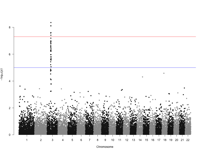
Let's make a basic manhattan plot. If you're using results from PLINK where columns are named SNP, CHR, BP, and P, you only need to call the manhattan() function on the results data.frame you read in.
manhattan(gwasResults)
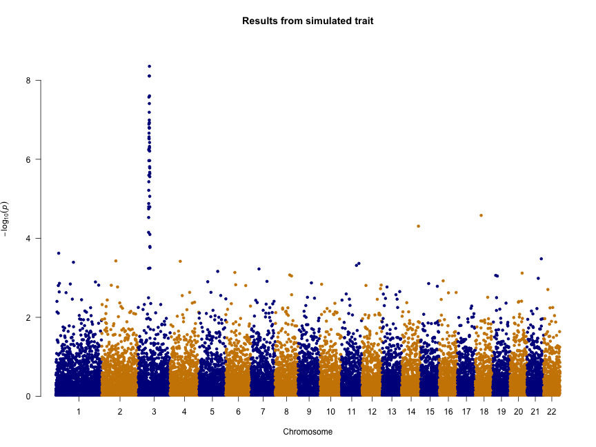
We can also change the colors, add a title, and remove the genome-wide significance and “suggestive” lines:
manhattan(gwasResults, col = c("blue4", "orange3"), main = "Results from simulated trait",
    genomewideline = FALSE, suggestiveline = FALSE)
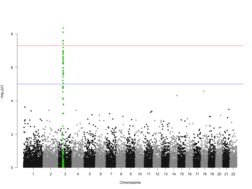
Let's highlight some SNPs of interest on chromosome 3. The 100 SNPs we're highlighting here are in a character vector called snpsOfInterest. You'll get a warning if you try to highlight SNPs that don't exist.
head(snpsOfInterest)
[1] "rs3001" "rs3002" "rs3003" "rs3004" "rs3005" "rs3006"
manhattan(gwasResults, highlight = snpsOfInterest)
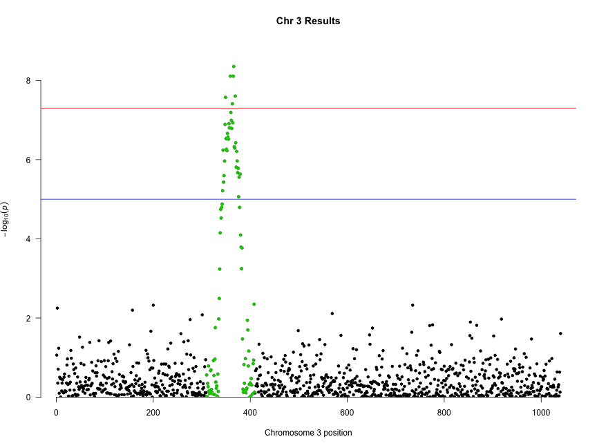
We can combine highlighting and limiting to a single chromosome to “zoom in” on an interesting chromosome or region:
manhattan(subset(gwasResults, CHR == 3), highlight = snpsOfInterest, main = "Chr 3 Results")
Finally, creating Q-Q plots is straightforward – simply supply a vector of p-values to the qq() function. You can optionally provide a title.
qq(gwasResults$P, main = "Q-Q plot of GWAS p-values")

Read the blog post or check out the package vignette for more examples and options.
vignette("qqman")

Pingback: Sifting through 2014 on Haldane’s Sieve | Haldane's Sieve